Personal UX project for the creation of a peer-to-peer second-hand book marketplace.

The idea of applying a circular economy to the world of books is the starting point of this project.
Many second-hand books remain forgotten on shelves, even though they can still hold value for other readers.
Based on this opportunity, I propose a peer-to-peer book exchange platform that allows them to be put back into circulation.
The goal is to extend their lifespan, encourage reuse, reduce paper consumption, and promote a more accessible, sustainable, and environmentally responsible way of reading.
I design an interview aimed at finding answers to questions such as:
Once designed, I interview readers at street level at the Madrid Book Fair.
![image of wireless security solutions interface [interface]](https://cdn.prod.website-files.com/6987c91cbc68347eae91cc79/6a241316fdbf5bd9fbfcdb7b_entrevista.webp)
I create a short online survey and send it to friends and acquaintances with reading habits, achieving around 30 completed answered surveys.
![image of wireless security solutions interface [interface]](https://cdn.prod.website-files.com/6987c91cbc68347eae91cc79/6a269bc922a065761c0b5561_encuesta.webp)
I analyze book exchange platforms such as BookMoch and Piladelibros, focusing on their UX, history, and monetization model, as well as Goodreads for its social network aspects.
![image of wireless security solutions interface [interface]](https://cdn.prod.website-files.com/6987c91cbc68347eae91cc79/6a22129f045e6d8fd7002db6_benchmark%20books.webp)
From the research results, several valuable conclusions are drawn:
![image of wireless security solutions interface [interface]](https://cdn.prod.website-files.com/6987c91cbc68347eae91cc79/6a1d9aad6b41d9347124bccb_research.png)
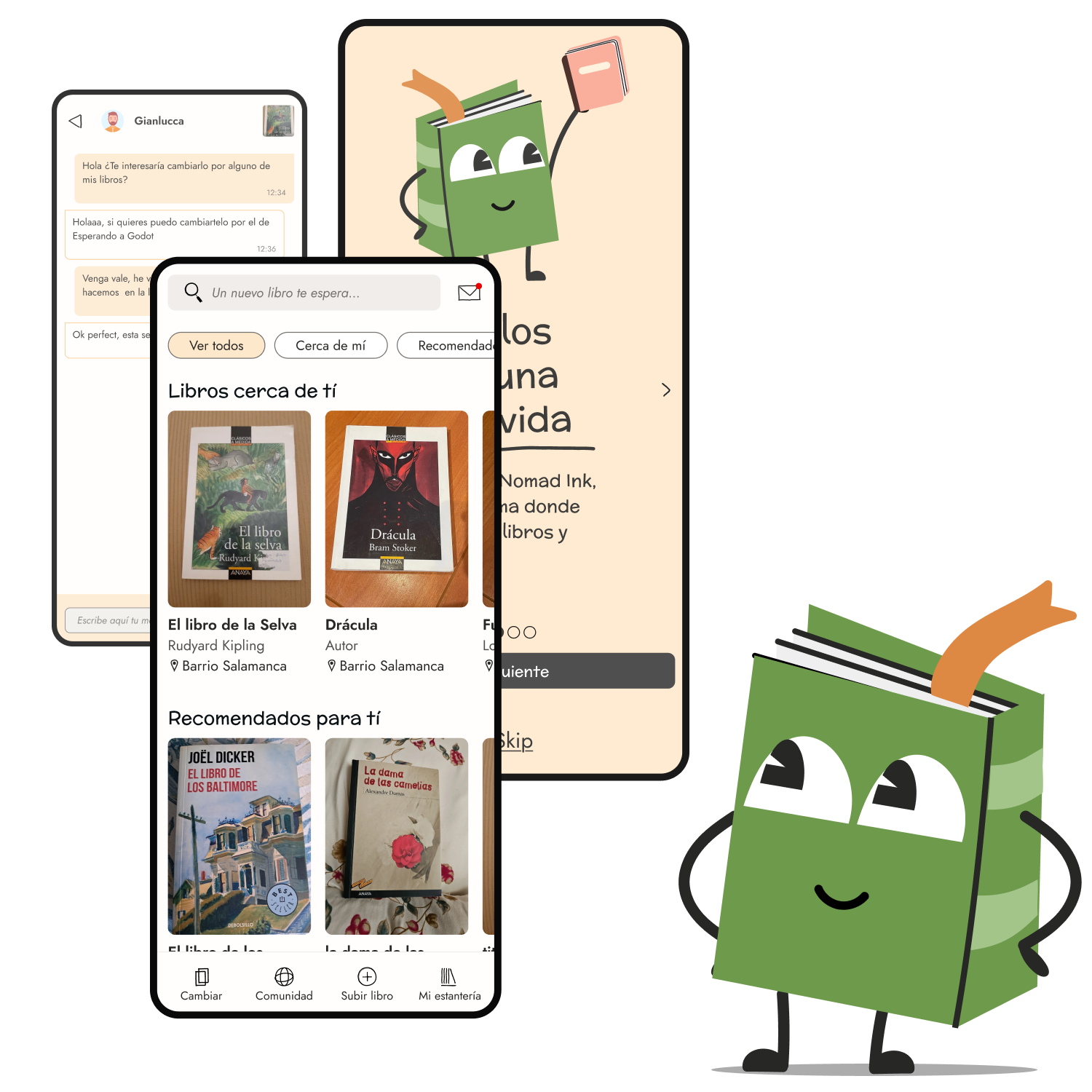
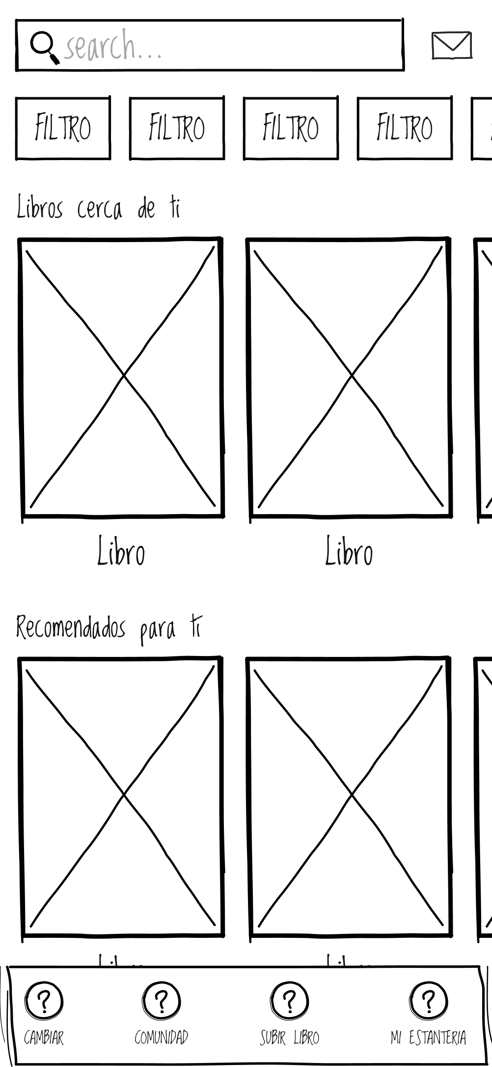
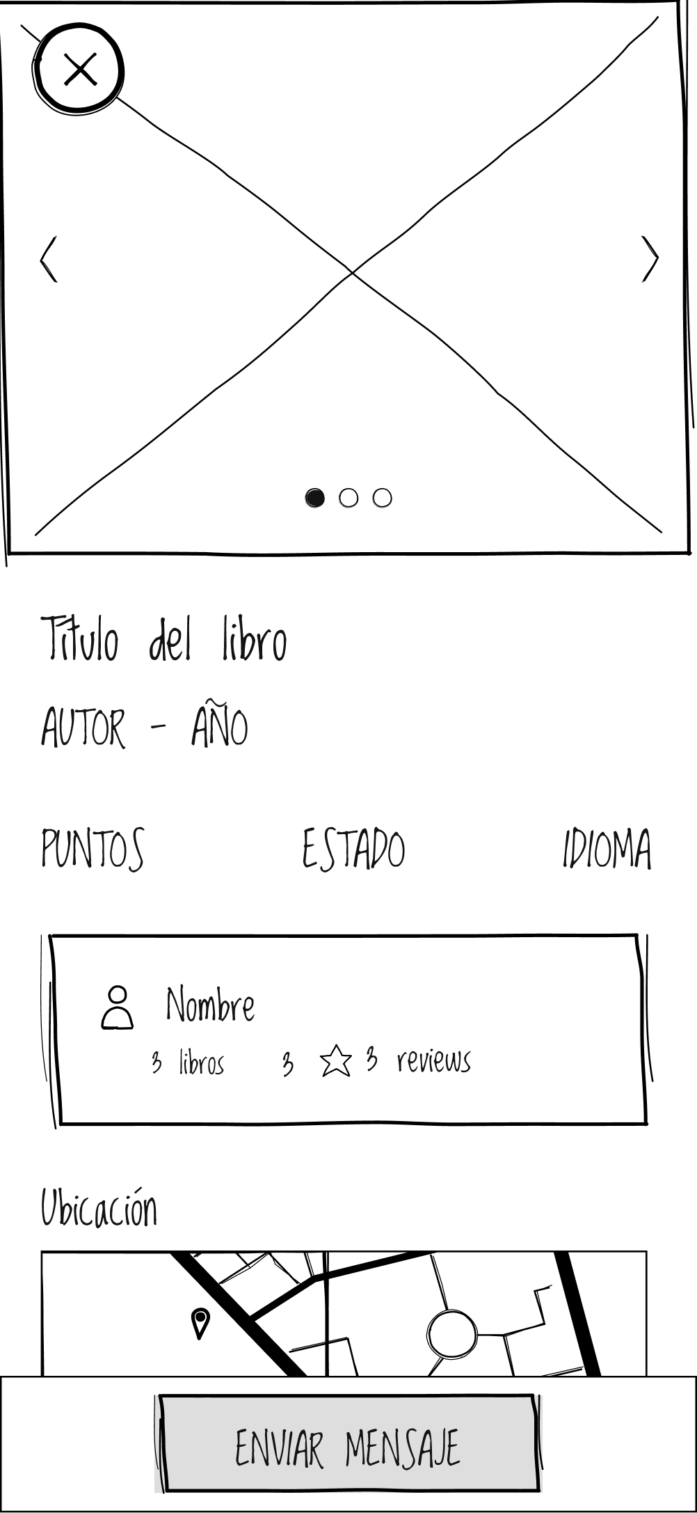
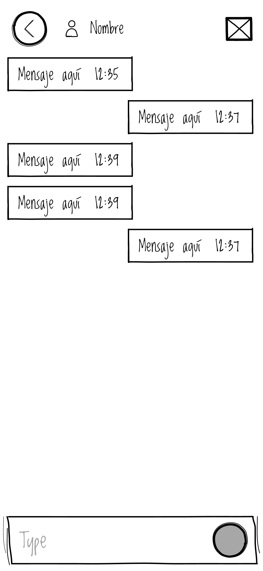
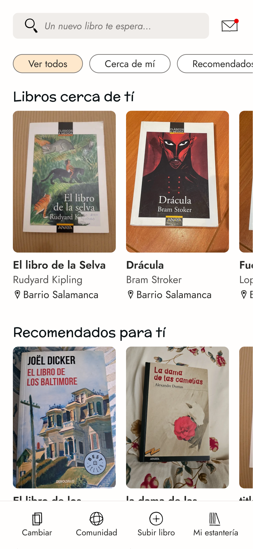
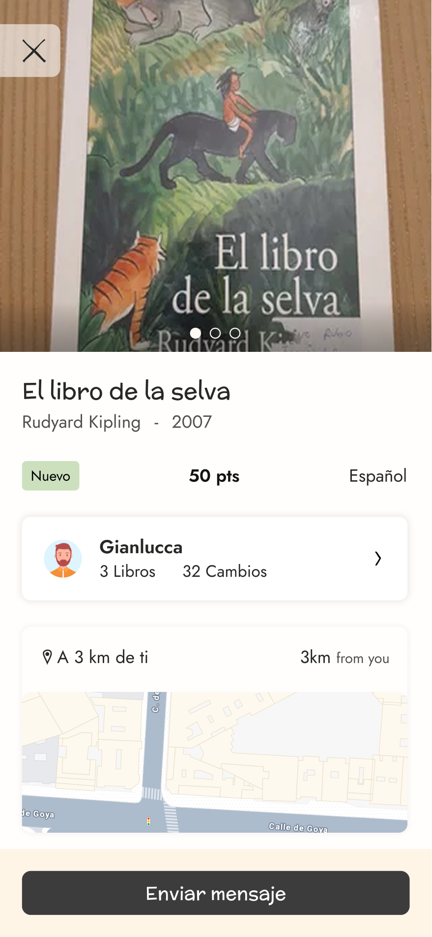
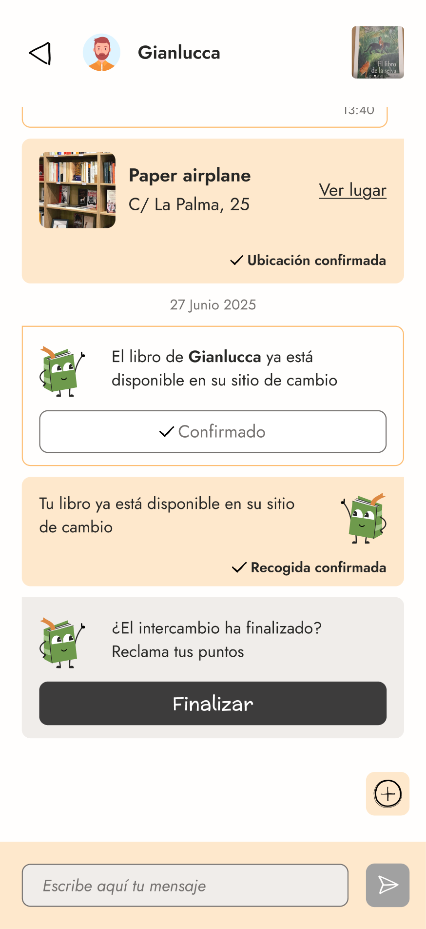
I designed the main flow covering the book exchange process between users.

Irregular, brushstroke-style shapes were chosen to evoke the doodles and underlines often found in old books.
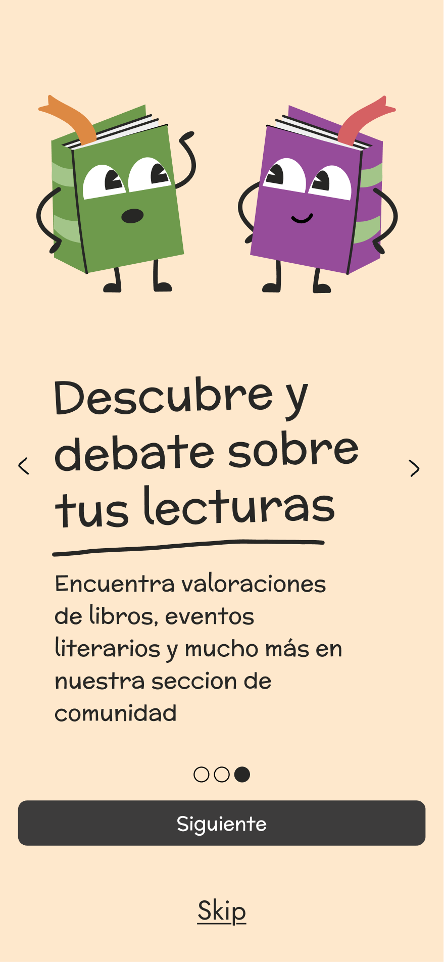
A mascot named Booky was created to serve as the central element of the brand identity.
I choose a handwriting, organic font that conveys naturality and handwriting vibes
I choose a peach cream hue inspired in the color of old books, which use to turn yellow with time
This project gave me the opportunity to experience the full product development lifecycle, from research to design. Moving forward, defining a clear and sustainable monetization strategy would be a key step toward validating the product as a viable business.


