Brand identity and social media direction for a new event company creating rural weekend experiences in Spain.
After the Covid period, a group of entrepreneurs from Madrid decided to create an event company focused on bringing people back together in person through nature, play and shared experiences.
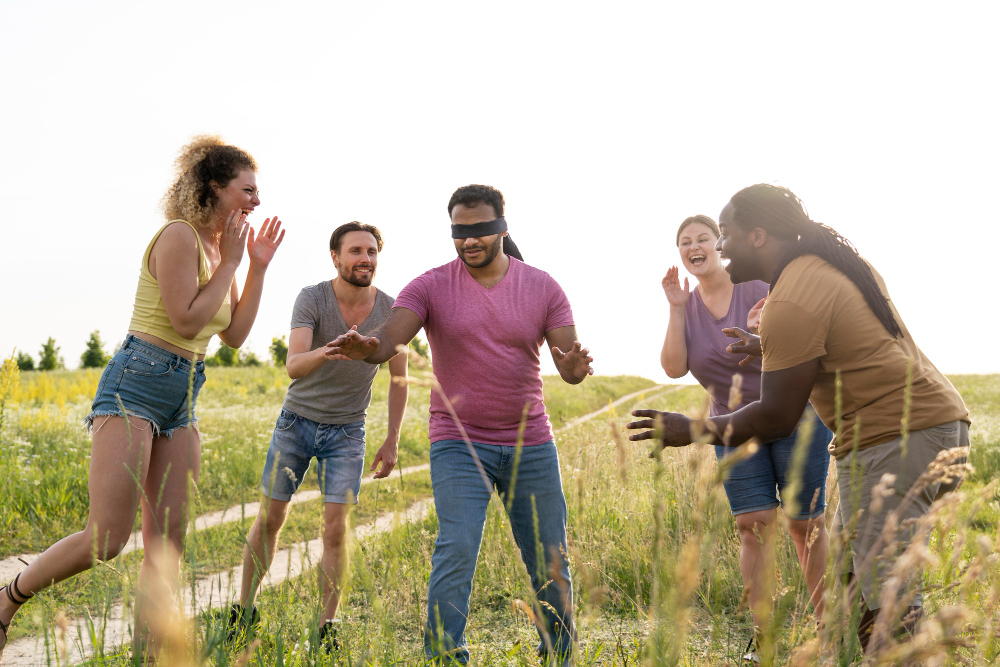
The idea was simple: weekend getaways in rural houses with strangers, inspired by the spirit of summer camps and set in natural environments.
As Art Director and Copywriter, my role was to create a brand identity aimed at people aged 23 to 35: optimistic, lively and approachable, with a strong connection to nature, friendship and authenticity.
The brand needed to feel social and playful, while still being trustworthy enough for people to join an experience with strangers.
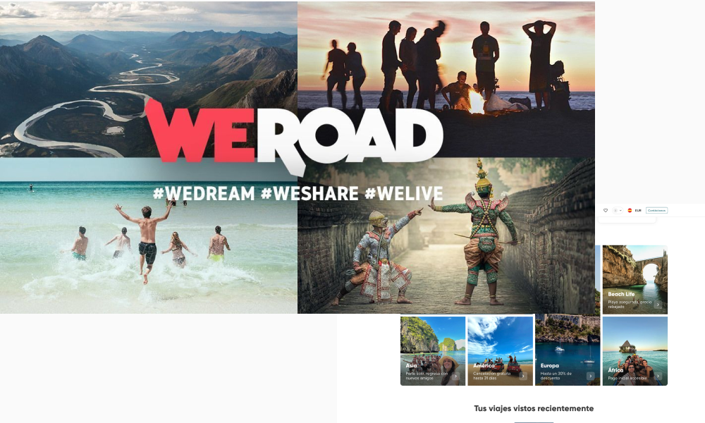
At the time, there was no direct service positioned exactly like Boonie. The competitive landscape was mainly made up of nature experience providers, travel brands and group trip companies.
I analysed brands such as WeRoad and Huakai, which organise trips with groups of strangers. Their branding usually relies on vibrant colours, clean interfaces and an energetic tone of voice.
This helped identify an opportunity for Boonie: to build a warmer, more intimate and more handcrafted identity, closer to the feeling of a camp weekend than a travel platform.
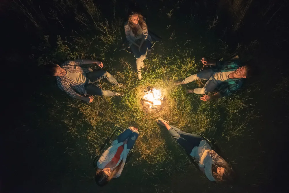
The chosen concept, a hut, was based on the idea of a temporary home: intimate, natural and welcoming.
The hut became the central visual metaphor, evoking the atmosphere of a summer camp in the mountains.
![image of wireless security solutions interface [interface]](https://cdn.prod.website-files.com/6987c91cbc68347eae91cc79/6a035a755b5014f6ca514060_caban%CC%83a.webp)
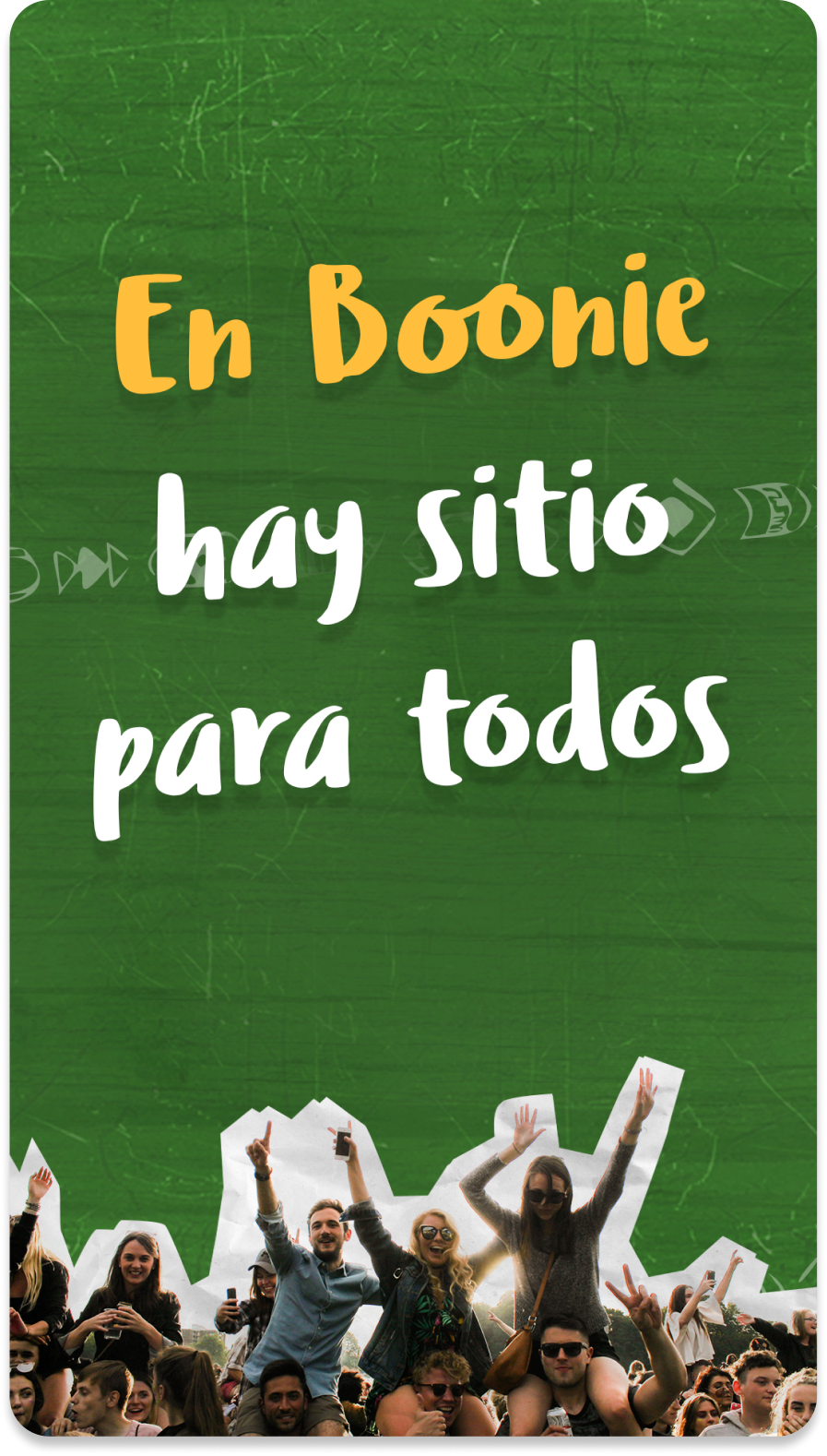
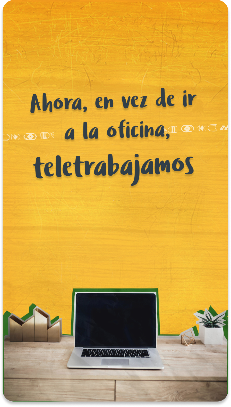
I drew inspiration from the elements that best connected with the value proposition: the classic aesthetic of North American summer camps, wooden textures, outdoor signage and handcrafted visual codes.
![image of wireless security solutions interface [interface]](https://cdn.prod.website-files.com/6987c91cbc68347eae91cc79/6a0352cb05929b6926fb9747_campamentos%20.webp)
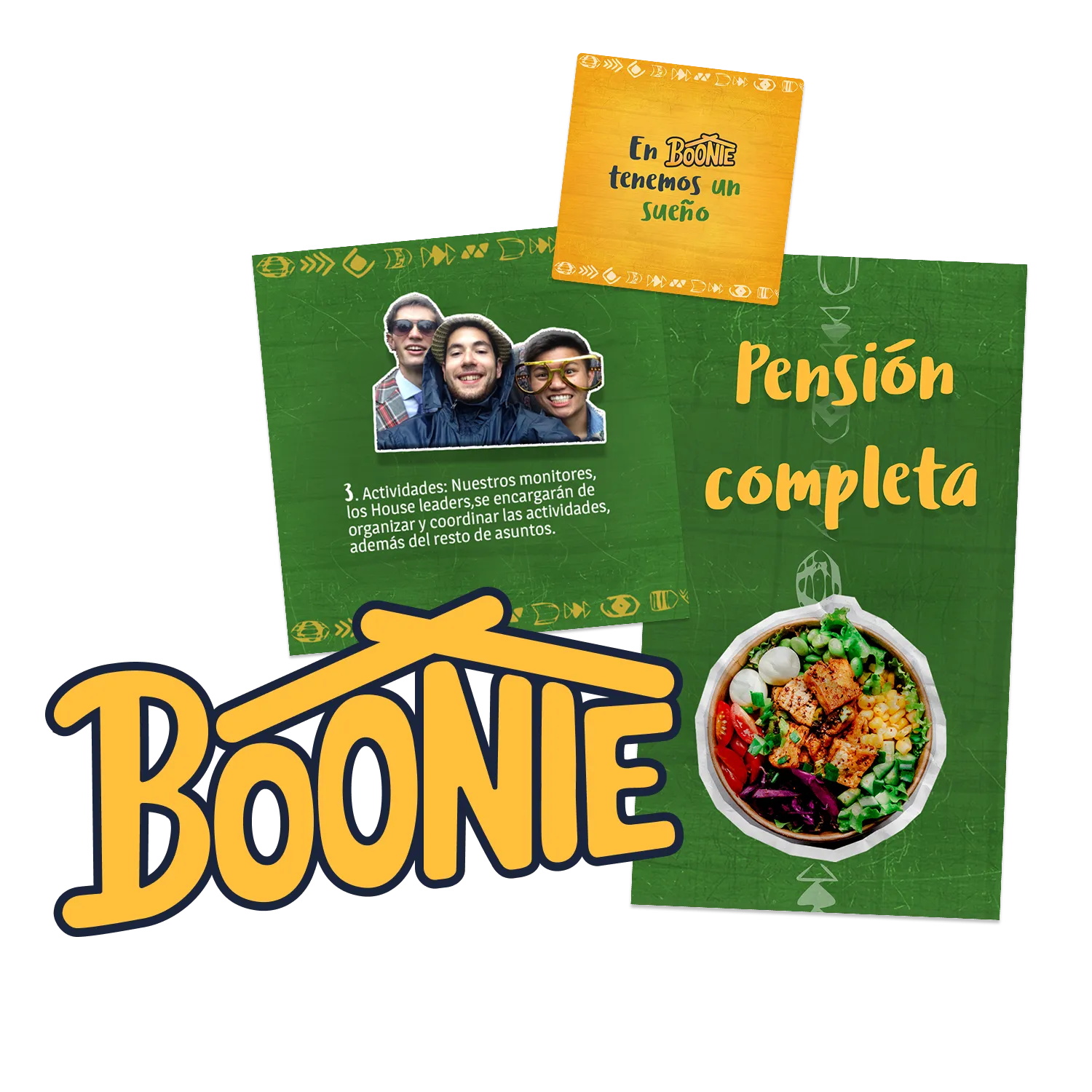
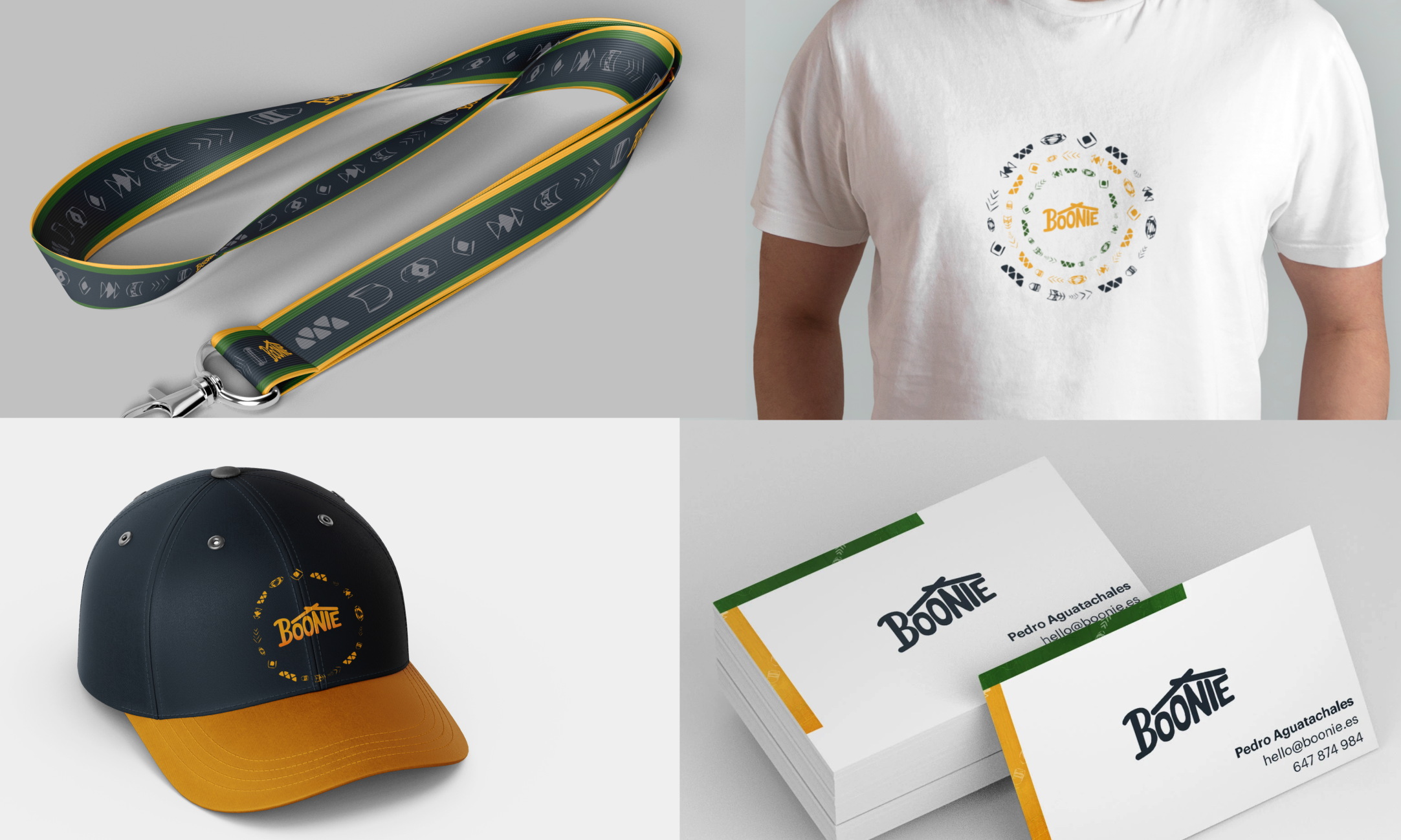
I created a rounded and friendly logo that represents people coming together under the same roof.
The intersection of the strokes directly references the roof of a hut built with logs, reinforcing the ideas of shelter, community and shared experience.
![image of wireless security solutions interface [interface]](https://cdn.prod.website-files.com/6987c91cbc68347eae91cc79/6a0359f85249eaef8a98f47d_logotipo.webp)
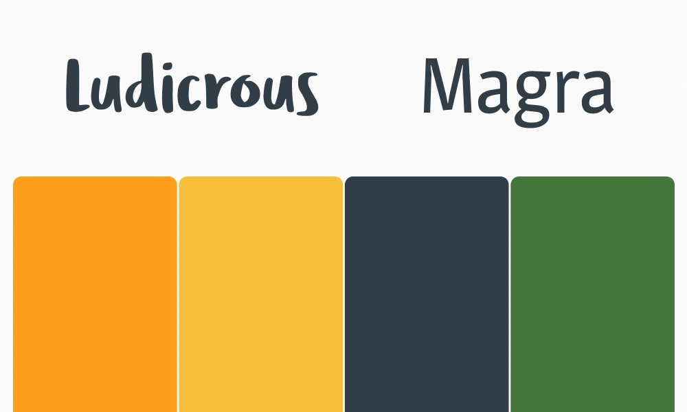
I selected orange as the main colour to express optimism, energy and youthfulness; grey to add balance and reliability; and green to connect the brand with nature.
The chosen typefaces were intended to feel human, warm and handmade, using handwritten and organic features rather than rigid geometric forms.
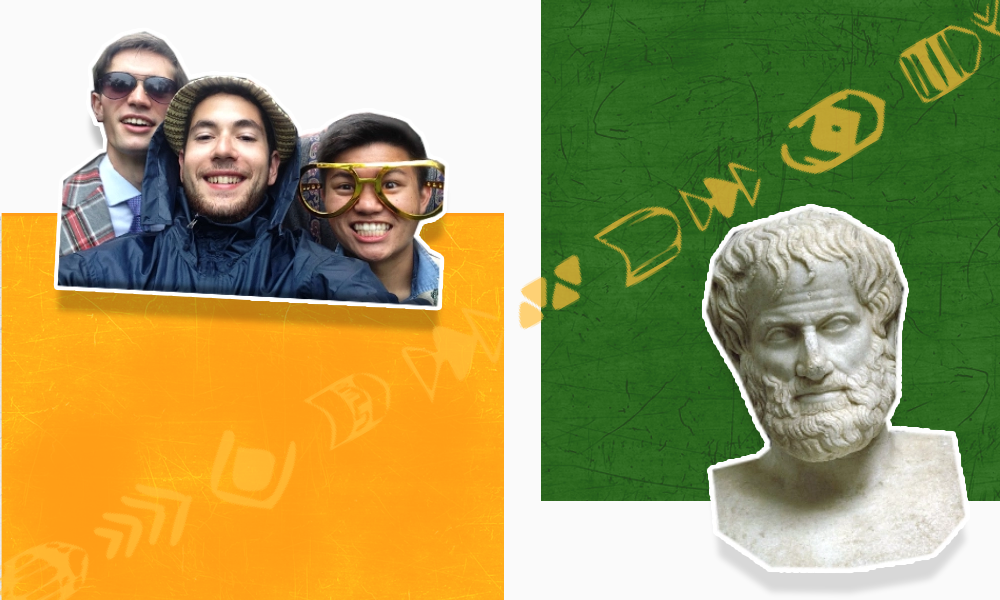
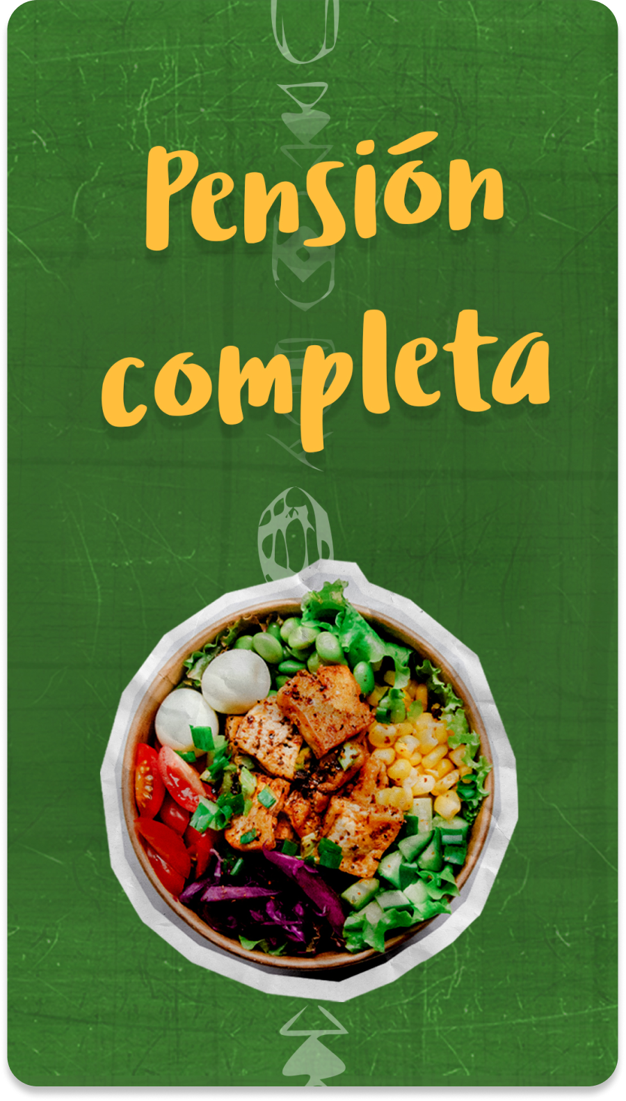
I used papercut-style textures for the imagery and wooden textures for the backgrounds, creating a handcrafted and outdoors-inspired visual language.
I also introduced symbolic line patterns to reinforce the ideas of home, connection and community.
The goal was to create a visual identity that felt close, natural and directly connected to the service experience and the environment where it takes place.
7. outcome
Within the first four months after the brand launch.
During the first six months after launch.
Featured in Spanish media outlets including OKDiario and Público, increasing early brand visibility.


