Creative concept and landing page designed to attract investment and position a B2B SaaS platform within the real estate sector.

Real estate agents manage several tools on a daily basis to carry out their work: certified mail, burofax delivery, digital signatures and other administrative processes.
These fragmented tools do not coexist within a single ecosystem, creating interruptions across the workflow.
After identifying this problem, Alquiler Seguro Group decided to start developing a digital platform that could bring these services together into one product, while seeking internal funding for its first stage of development.
My goal as Art Director was to create a landing page that could present the project to internal shareholders and support the investment round for the development of the MVP.
Since the brand only had a logo and a primary colour, I had to build a distinctive and disruptive visual identity capable of selling the product through the landing page.
The competitive analysis revealed an ecosystem of SaaS platforms with a highly homogeneous branding pattern.
Most competitors prioritised clarity and efficiency over differentiation, resulting in generic visual identities, similar design systems and communication focused almost exclusively on functionality.
This created low brand differentiation in a market where products are often perceived as interchangeable tools.
My intention was to find a tangible element that could visually represent the product’s value proposition: agility, speed and access to high-quality service providers, while remaining connected to the real estate world.
The result of this exploration was a key: an object that symbolises access, control and capability within the sector.
![image of wireless security solutions interface [interface]](https://cdn.prod.website-files.com/6987c91cbc68347eae91cc79/69fcc624f354261e1a9ba5a5_llave.png)
The key was reinterpreted through a fictional visual language, turning it into a fantasy and sci-fi inspired power object.
This approach was influenced by references such as the Kingdom Hearts video game franchise, where a key becomes the protagonist’s symbolic weapon, as well as the legend of Excalibur and other mythological references.
![image of wireless security solutions interface [interface]](https://cdn.prod.website-files.com/6987c91cbc68347eae91cc79/69fcb660fcc9db546b540c2c_inspiracion%20llaves.png)
I combined the available brand symbol with the core creative concept.
The result was a recognisable key with a strong personality, shaped by the brand itself and designed to become the main key visual of the project.
![image of wireless security solutions interface [interface]](https://cdn.prod.website-files.com/6987c91cbc68347eae91cc79/69fcc9af6eb82f135e8bd7b3_construccion.webp)
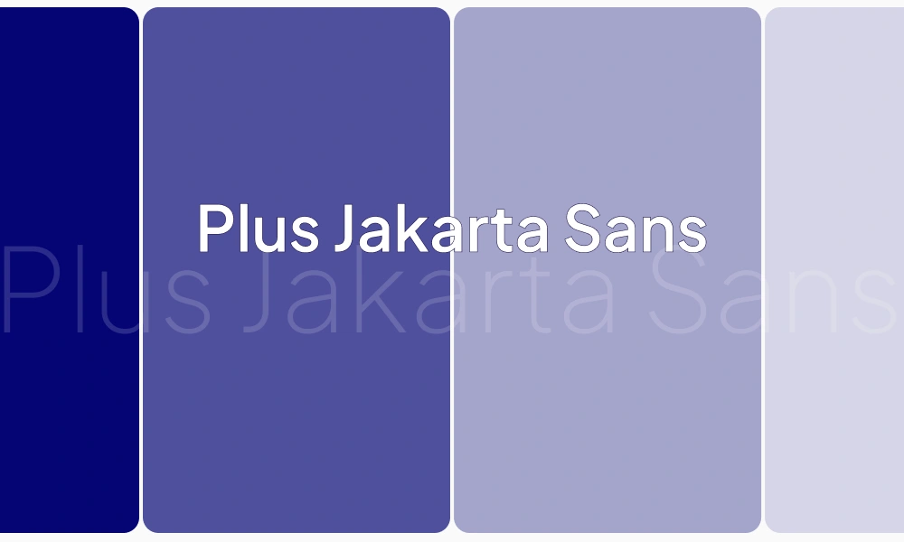
I defined a visual identity based on blue tones and the Plus Jakarta Sans typeface, reinforcing seriousness, trust and modernity.
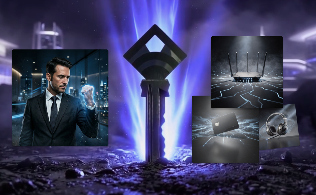
Using generative AI tools, I created a photorealistic three-dimensional key, along with supporting assets in the same visual style.
4. Visual

The project presentation helped Apitek secure funding for the first stage of the platform’s development, backed by Aurica Capital.